Minimalist furniture brands have a natural advantage online. Clean forms, considered materials and uncluttered styling can translate effectively into high-quality photography and carefully designed digital experiences. But creating an e-commerce website for a minimalist furniture business involves more than choosing a simple layout and using plenty of white space.
The website needs to communicate the brand’s design philosophy while also giving customers enough information to make a confident purchase. Furniture is rarely an impulse purchase. Customers want to understand dimensions, materials, construction, colour, comfort, delivery, care requirements and how a piece will work within their home.
For minimalist furniture brands, the challenge is therefore balancing simplicity with substance.
A successful e-commerce website should look restrained without becoming empty, feel premium without becoming difficult to use, and present products beautifully without hiding the practical information customers need.
For furniture businesses operating in a competitive online market, website design should ultimately support the entire customer journey, from product discovery and research through to purchase and post-purchase support.
Start With the Brand’s Design Philosophy
Minimalism does not mean that every furniture website should look identical.
One brand may focus on Scandinavian-inspired furniture, while another may specialise in contemporary Australian design, natural timber, architectural forms or refined commercial interiors. The website should communicate what makes the brand distinctive rather than simply copying the visual conventions associated with minimalist design.
This starts with understanding the brand’s design philosophy.
Consider:
- What materials are central to the collection?
- What design principles influence the products?
- Who is the ideal customer?
- Are products designed for apartments, family homes, commercial spaces or multiple environments?
- Is the brand focused on affordability, craftsmanship, longevity, customisation or design originality?
- What makes the collection different from competing furniture ranges?
These questions should influence typography, photography, navigation, colour, product presentation and written content.
A minimalist website should remove unnecessary visual noise, but it should not remove useful information.
The objective is clarity.
Use Visual Simplicity to Strengthen Product Presentation
Furniture is highly visual, so photography should be one of the most important components of the website.
Product photography should show more than the basic shape of a chair, table or sofa against a plain background.
Customers need to understand scale, proportion, texture and context.
A strong product photography system might include:
- Clean product images from multiple angles
- Lifestyle photography within realistic interiors
- Close-ups showing materials and finishes
- Images demonstrating scale
- Detail shots of construction or craftsmanship
- Different colour or material options
- Room settings that show how products can be styled
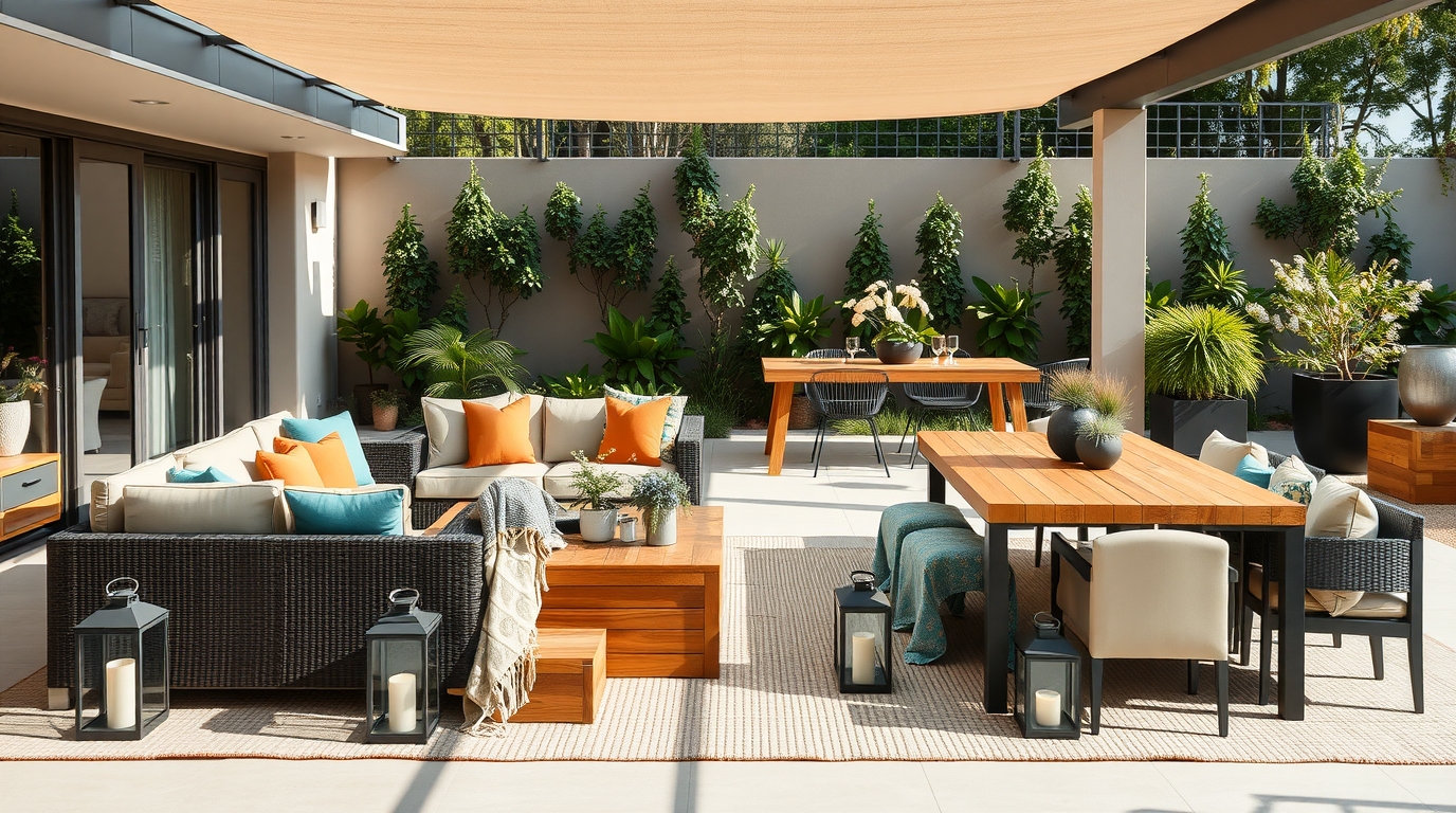
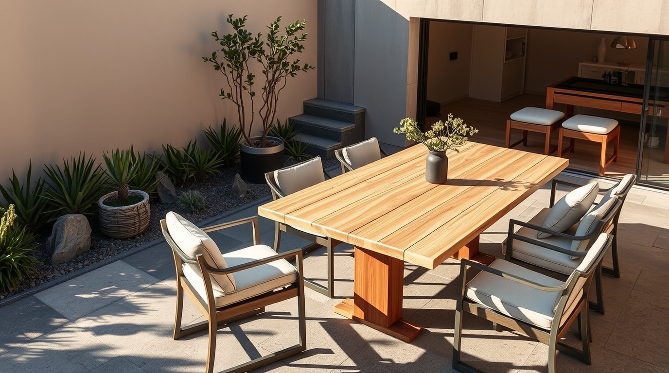
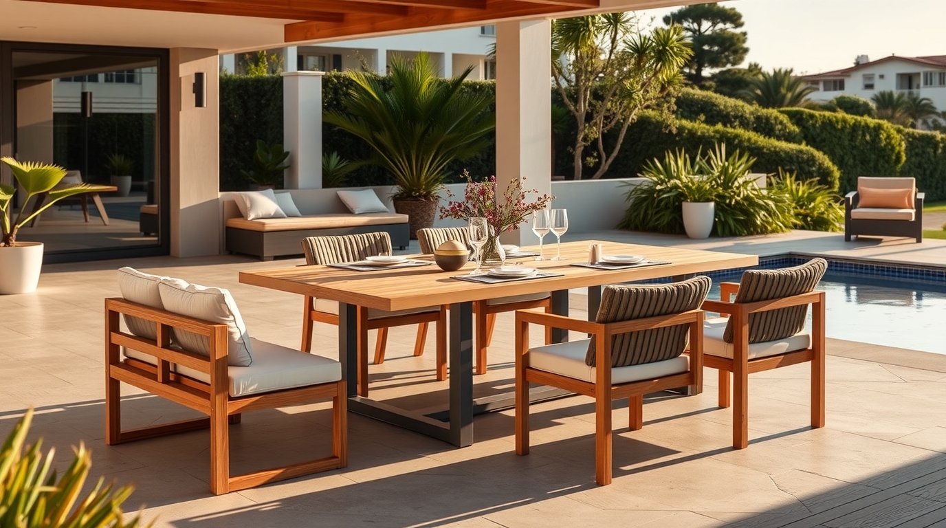
Lifestyle photography is particularly valuable for minimalist furniture because the products can otherwise appear visually similar when displayed against a plain background.
A dining table photographed in isolation communicates its shape. The same table photographed in a well-designed dining space can communicate its scale, atmosphere and intended use.
The two images serve different purposes.
Product photography should therefore support both aesthetic appeal and practical decision-making.
Design Product Pages Around Customer Questions
A minimalist furniture website should never allow the pursuit of visual simplicity to produce vague product pages.
The product page is where inspiration becomes evaluation.
Customers may want to know:
- What are the exact dimensions?
- What materials are used?
- What finishes are available?
- Is the product assembled?
- How much does it weigh?
- What is the recommended care process?
- Is it suitable for outdoor or indoor use?
- How long will delivery take?
- What happens if the product arrives damaged?
- Can the product be customised?
- What colours or sizes are available?
- Does the furniture require professional installation?
These details should be easy to locate.
A strong product page can begin with a clean visual presentation and concise description, then provide deeper information through clearly organised sections.
For example:
Product overview
A concise explanation of what the product is and what makes it distinctive.
Dimensions
Clear measurements, ideally supported by diagrams where useful.
Materials and construction
Specific information about timber, metal, fabric, stone, finishes or other materials.
Available options
Sizes, colours, finishes and configurations.
Care
Practical maintenance instructions.
Delivery
Relevant delivery information, lead times and applicable conditions.
Returns
Clear information about the applicable returns policy.
Frequently asked questions
Answers to common purchase objections.
The design can remain visually restrained while still providing considerable depth.
Make Product Navigation Intuitive
A minimalist furniture catalogue can become difficult to use if customers are forced to browse through an unnecessarily broad collection.
Navigation should reflect how customers actually shop.
Instead of relying entirely on product types, consider organising the catalogue around several useful dimensions.
These might include:
- Furniture type
- Room
- Collection
- Material
- Style
- Colour
- Size
- Price range
- Indoor or outdoor use
The exact structure will depend on the catalogue.
A customer looking for a dining table may already know the product category. Another may simply be furnishing a small apartment and want compact furniture.
Both users should have a sensible route into the catalogue.
Filters can be particularly useful for larger ranges. However, filters should be based on attributes customers genuinely use when making purchasing decisions.
Too many irrelevant filters create complexity rather than improving usability.
Build Collections Around Customer Intent
Collections can do more than group products visually.
They can help customers understand how individual products relate to a broader design concept.
For example, a furniture brand might create collections based on:
- Natural timber furniture
- Compact apartment furniture
- Contemporary dining
- Minimalist bedroom furniture
- Living room essentials
- Neutral upholstery
- New-season designs
These pages can provide an opportunity to introduce the collection before presenting individual products.
A well-developed collection page can also support organic search visibility when it genuinely addresses a useful category or customer need.
The important distinction is between a useful collection page and a thin page created simply to target another keyword.
Every category should have a clear purpose for the customer.
Give Customers Enough Information About Materials
Materials are often central to minimalist furniture.
A simple design may rely heavily on the quality and character of the material. Customers therefore need more information than a generic statement such as “premium materials”.
If a product uses solid timber, explain the species and relevant characteristics.
If a finish is available in several options, explain the differences.
If upholstery is used, provide appropriate information about the fabric, texture, composition and care requirements.
Specific information builds more confidence than adjectives.
It also gives customers useful information for comparing products.
For premium furniture, the material story can become an important part of the commercial proposition. The website should communicate that story without turning every product description into promotional copy.
Show Scale Clearly
One of the persistent challenges in online furniture sales is helping customers understand size.
A customer can read that a table is 1,800 mm long, but that measurement does not automatically communicate how the table will look in their dining room.
Scale can be demonstrated through:
- Lifestyle photography
- Dimension diagrams
- Images showing the product beside people
- Room photography
- Seating capacity information
- Recommended room sizes where appropriate
- Clear height, width and depth measurements
For larger furniture pieces, this information can directly influence purchasing confidence.
The website should make it easy for customers to determine whether the product is physically suitable for their space before they order.
This is useful commercially as well as from a customer-experience perspective. Better product information can help reduce avoidable uncertainty and potentially reduce issues associated with customers ordering products that do not suit their available space.
Make Product Variants Easy to Understand
Minimalist furniture ranges often contain variations in colour, material, dimensions and configuration.
A dining chair may be available in several upholstery colours. A sofa may have multiple configurations. A table may come in different sizes or timber finishes.
The website should make these choices immediately understandable.
When a customer selects a different variant, the relevant product image, price and availability should be clear.
From a technical SEO perspective, product variants also need careful implementation. Google provides specific guidance for representing product variants using ProductGroup and Product structured data, including attributes such as colour, size and material.
This matters because product information should be understandable not only to customers but also to search engines and e-commerce platforms.
The implementation should be planned alongside the website architecture rather than added as an afterthought.
Treat Delivery Information as Part of the Sales Experience
Furniture is fundamentally different from many small online purchases.
Products can be large, heavy, fragile or difficult to transport. Delivery arrangements may therefore be an important part of the buying decision.
A minimalist furniture website should not make customers hunt for basic delivery information.
Relevant information may include:
- Delivery areas
- Estimated lead times
- Freight arrangements
- Delivery charges
- Threshold or room-of-choice delivery
- Assembly requirements
- Installation services
- What customers should do when goods arrive
- Procedures for damaged deliveries
The exact information depends on the business model, but transparency is important.
If delivery costs cannot be calculated until an address is entered, explain this clearly.
If certain products have different lead times, make those differences visible on the relevant product pages.
A beautifully designed website loses credibility if the practical details of purchasing are difficult to find.
Build Trust Without Cluttering the Design
Minimalist design relies on restraint, but customers still need evidence that the business is credible.
Trust elements can be incorporated without overwhelming the interface.
Useful signals include:
- Genuine customer reviews
- Product ratings where appropriate
- Detailed product information
- Real project photography
- Clear company information
- Contact details
- Delivery information
- Returns policies
- Secure checkout
- Warranty information
- Trade or design services
- Customer support information
Reviews should be genuine and presented in a way that helps customers understand the product.
For example, a review discussing comfort, material quality or how a dining table performs in daily use can provide more practical value than a generic five-star rating.
Trust is particularly important when the customer cannot physically inspect the furniture before purchase.
Create a Website That Supports Search Visibility
An attractive e-commerce website also needs to be discoverable.
Search engine optimisation should be considered during the website planning process rather than added after the design is finished.
Product and category pages should have:
- Clear page titles
- Useful headings
- Descriptive product copy
- Strong internal linking
- Descriptive image information
- Logical URLs
- Accessible content
- Appropriate structured data
- Useful category descriptions
Google’s current documentation explains that product structured data can help eligible product pages appear with information such as price and availability in relevant search experiences.
Google also recommends monitoring structured data through Search Console after implementation and website changes.
For furniture brands, this creates an important connection between website design, e-commerce functionality and SEO.
The website should not be designed purely for visual presentation and then optimised later.
The two disciplines should work together from the beginning.
Use Content to Help Customers Make Decisions
Not every customer arrives ready to buy.
Some may be researching furniture styles, comparing materials or trying to determine what size of table will work in their home.
Useful content can capture these research stages.
A minimalist furniture brand might publish:
- Furniture buying guides
- Dining table sizing guides
- Material comparisons
- Furniture care guides
- Room styling advice
- Small-space furniture ideas
- Guides to choosing upholstery
- Comparisons between different finishes
- Advice on creating a minimalist living room
- Product comparison articles
The purpose is not simply to generate blog traffic.
Content should help customers move naturally towards relevant products.
For example, an article about choosing the right dining table size can link to appropriate dining table collections. A guide to timber finishes can link to products available in those finishes.
This creates a logical relationship between SEO content and e-commerce.
Use Internal Linking to Connect Inspiration and Products
A strong e-commerce website should not leave customers at the end of an article or collection page with nowhere useful to go.
Internal links can connect:
Educational content → Collection → Product → Related product
For example:
A guide about minimalist dining rooms could link to a dining furniture collection. The collection could link to individual dining tables. Each table could link to compatible dining chairs or lighting.
This structure benefits the customer because it reduces the effort required to find related products.
It can also help search engines understand the relationship between different sections of the website.
Internal linking should be natural and useful rather than built simply to place keywords on a page.
Make Mobile Shopping a Core Experience
Furniture customers may discover products on a desktop computer, but many will also browse from smartphones.
The mobile experience therefore needs to support serious product research rather than simply shrinking the desktop design.
Important considerations include:
- Fast-loading product images
- Easy-to-use navigation
- Clear product options
- Readable specifications
- Accessible filters
- Simple enquiry functionality
- Easy-to-use add-to-cart controls
- Straightforward checkout
- Clear delivery information
Large lifestyle images can create visual impact, but they should not make the site unnecessarily slow.
Mobile design is not about removing information.
It is about presenting the information in a usable hierarchy.
Make Checkout Feel Consistent With the Brand
A premium furniture website can lose credibility during checkout if the experience suddenly becomes cluttered or confusing.
The checkout should feel like a natural continuation of the brand.
Customers should be able to understand:
- What they are purchasing
- Which variant they selected
- The total price
- Delivery costs
- Expected delivery timing
- Payment options
- Applicable policies
Unexpected costs or unclear conditions can create hesitation at the final stage.
A clean checkout experience should therefore prioritise clarity over unnecessary design elements.
The objective is simple: make completing the purchase straightforward.
Connect E-Commerce With Social Media
Minimalist furniture is naturally suited to visual platforms, but social media should not operate independently from the website.
A social post can introduce a new collection. A project image can demonstrate how a product looks in an actual interior. A short video can show material details or product construction.
The website then provides the deeper information required to purchase.
This creates a useful pathway:
Social discovery → Website → Product research → Purchase
Social media can also provide ideas for future website content.
If customers repeatedly ask about dimensions, materials, care or styling, those questions can become product-page improvements or educational content.
The website and social channels should therefore inform one another.
Use E-Commerce Data to Improve the Website
Once an online store is operating, customer behaviour provides useful information about where improvements may be needed.
Businesses can examine:
- Product views
- Collection performance
- Add-to-cart activity
- Checkout progression
- Purchases
- Revenue
- Average order value
- Product-level sales
- Traffic sources
- Search performance
- Returns
- Frequently viewed products
The important point is to interpret the data commercially.
A product that attracts large amounts of traffic but rarely generates purchases may require a closer examination of price, photography, product information, shipping, customer expectations or audience targeting.
Similarly, a product with strong conversion but limited visibility may represent an opportunity for stronger SEO, Google Ads or social promotion.
The website should become a source of commercial insight, not simply a place where transactions happen.
Avoid Over-Designing the Minimalist Website
One of the biggest risks for minimalist brands is confusing simplicity with minimal functionality.
A website can look sophisticated while still being frustrating to use.
Common problems include:
- Excessively small text
- Hidden navigation
- Product information buried behind multiple clicks
- Overuse of animations
- Difficult filters
- Weak search functionality
- Large images that slow the site
- Unclear calls to action
- Insufficient product specifications
- Poor mobile usability
Minimalism should remove unnecessary elements.
It should not remove useful ones.
The best minimalist e-commerce websites are usually not the websites with the fewest components. They are the websites where every component has a clear purpose.
Plan the Website Around the Entire Customer Journey
A successful furniture e-commerce website should accommodate different levels of purchase readiness.
A customer might discover the brand through Instagram and browse several collections.
Another customer may arrive through Google after searching for a specific dining table.
Another may read a buying guide before looking at products.
Someone else may already know the product name and arrive directly on the product page.
The website needs to support all of these journeys.
A practical structure could include:
Homepage
Brand positioning, major collections, featured products and pathways into the catalogue.
Collection pages
Clear product groupings with useful introductory content.
Product pages
Detailed information, photography, variants, pricing, delivery and purchasing options.
Guides and articles
Helpful information that supports research and search visibility.
About
Brand philosophy, expertise, materials and story.
Delivery and returns
Clear practical information.
Contact
Accessible customer support and enquiry options.
Trade or design services
Where relevant, dedicated information for interior designers, architects, developers or commercial customers.
This creates a website that serves both the brand and the customer.
Integrate Google Ads With the E-Commerce Website
A strong website also gives paid search campaigns somewhere useful to send customers.
Google Ads can be particularly relevant for furniture searches where the customer has clear commercial intent.
Instead of directing every visitor to the homepage, campaigns can point customers towards the most relevant product or collection page.
For example, someone searching for a particular type of minimalist dining table should ideally arrive at a relevant collection or product rather than having to navigate from the homepage.
The landing page should then match the expectation created by the advertisement.
This relationship between search intent, advertising, landing page quality and product information can make the overall digital marketing system more coherent.
Build for Future Catalogue Growth
A website should not only work for today’s product range.
Furniture brands may introduce new collections, additional finishes, different sizes or complementary products over time.
The website architecture should therefore be scalable.
Before launch, consider:
- How new products will be added
- How collections will be organised
- How product variants will work
- How filters will be maintained
- How inventory will connect with the website
- How product images will be managed
- How structured data will be generated
- How discontinued products will be handled
- How redirects will be managed
- How category pages will evolve
This becomes increasingly important as the catalogue grows.
A structure that works for 20 products may become difficult to manage with several hundred.
The Best Minimalist E-Commerce Websites Balance Beauty and Usability
Minimalist furniture brands should not have to choose between a beautiful website and a practical one.
The strongest e-commerce experiences combine the two.
The visual design establishes the brand. Photography communicates the products. Product pages provide the detail needed for confident purchasing. Navigation makes discovery straightforward. Content answers research questions. Technical SEO helps search engines understand the catalogue. Delivery and returns information reduces uncertainty. Checkout turns interest into transactions.
The result should feel simple to the customer, even though considerable strategy sits behind that simplicity.
For furniture brands, this balance is particularly important because customers are buying physical products that need to fit their homes, lifestyles and expectations.
A successful website therefore does more than display minimalist furniture beautifully. It helps customers understand why each product is right for them and gives them a clear path towards purchase.
Conclusion
Creating an e-commerce website for a minimalist furniture brand requires more than minimalist visual styling.
The website needs to express the brand’s design philosophy while providing enough information for customers to make informed decisions. Product photography, dimensions, materials, variants, delivery information, reviews and practical specifications all contribute to purchase confidence.
Search visibility also needs to be considered from the beginning. Product structured data, logical catalogue architecture, useful collection pages, internal linking and customer-focused content can help connect the website with people actively researching furniture online. Google’s current guidance specifically supports structured product information and product variants for eligible search experiences.
Most importantly, simplicity should serve the customer rather than become a design objective in isolation.
A well-built minimalist furniture website removes friction, communicates quality, supports discovery and makes purchasing easier.
For brands operating in the competitive home and lifestyle sector, the website can become much more than an online catalogue. It can function as the centre of the brand’s e-commerce, SEO, content, advertising and customer experience strategy.
If your furniture business needs an e-commerce website that combines strong design with practical functionality and commercial thinking, Home & Lifestyle Marketing Co can help assess the structure, content and digital strategy needed to support your online growth.
To learn more, please visit www.hlmco.com.au