Colour Trends in Luxury Outdoor Living: From Sandstone Neutrals to Ocean Hues — and Why You’re Being Let Down if Your Supplier Doesn’t Offer Hundreds of Fabrics and Colours
Colour as the language of outdoor luxury
Colour has become the most powerful design element in modern outdoor living. It determines mood, links architecture to landscape, and separates a well-considered home from one that feels generic. In Australia, where light is bright and ever-changing, colour must be treated as both art and science.
The palettes that now define high-end outdoor furniture draw inspiration from sandstone cliffs, coastal waters, and the subtle greys of bushland bark. Yet while style trends evolve every year, one truth remains constant: genuine luxury depends on choice. If your supplier can’t offer hundreds of fabrics and colours, you’re being denied the essential freedom that defines bespoke design.
The return to nature-derived palettes
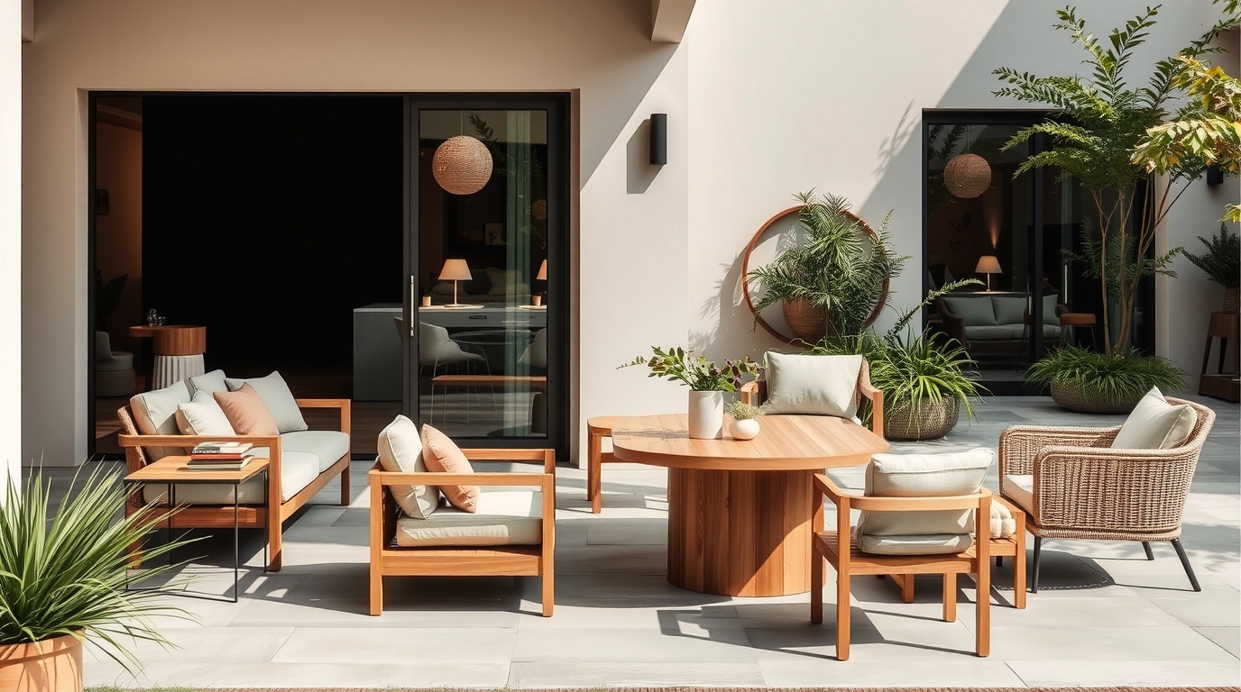
The most elegant outdoor colour stories of 2025 begin in the landscape. Sandstone neutrals, oyster whites, and weathered driftwood tones provide the calm foundation for everything from sofas to dining chairs. These hues absorb Australia’s intense sunlight rather than reflect it harshly, creating visual comfort. They also blend effortlessly with the ochres, olives, and silvers found in native flora. Nature is never a single colour—it’s a composition of tones—and today’s luxury furniture mirrors that richness through subtle layering instead of bold contrast.
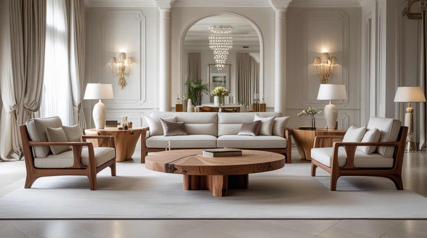
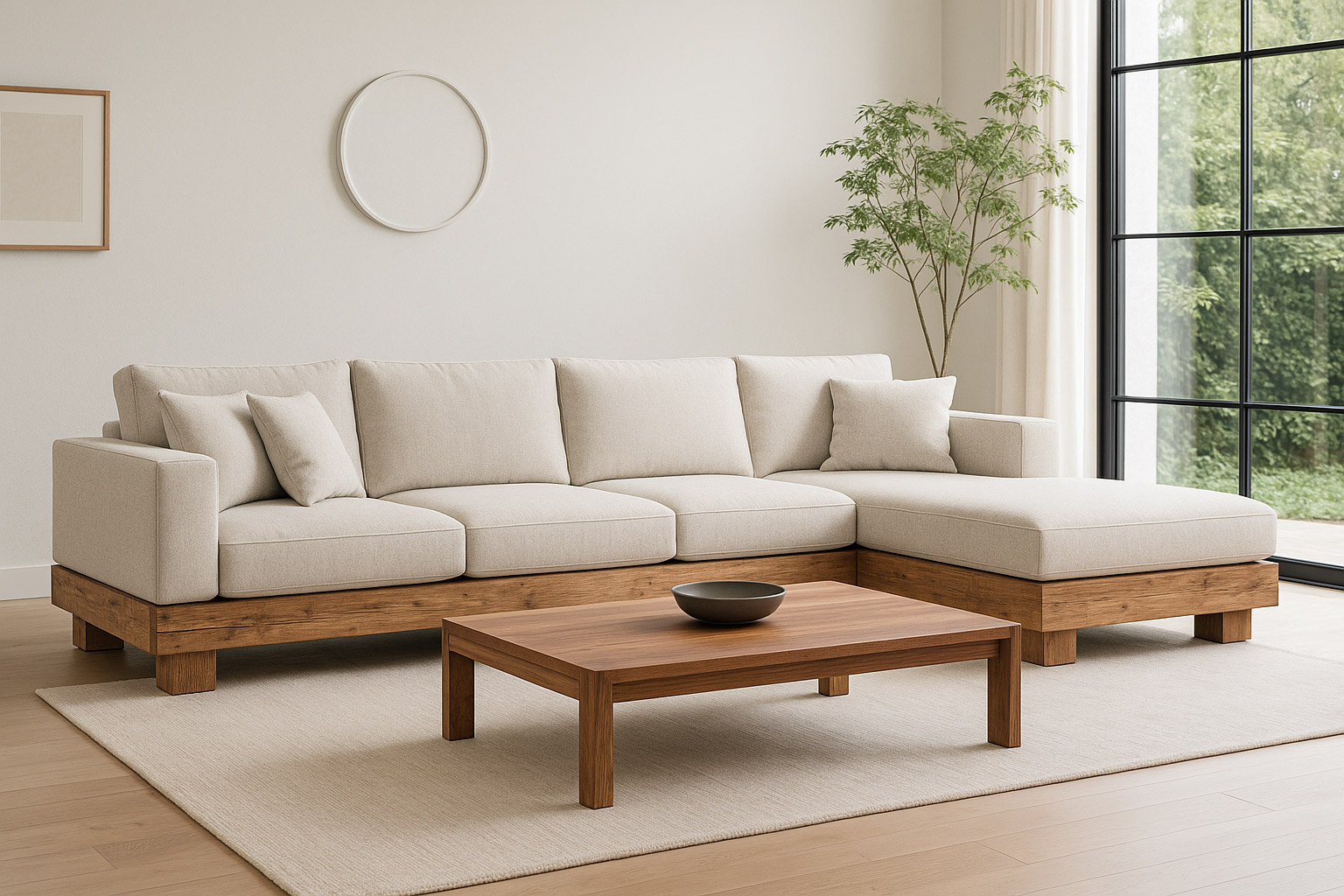
Sandstone and stone-washed neutrals: the enduring classics
Neutral doesn’t mean bland. In the hands of a skilled designer, sandstone can appear as warm beige in morning light and soft grey by dusk. Pale stone frames, ivory cushions, and brushed-teak surfaces build an atmosphere of timeless refinement. These colours never shout; they breathe. They also partner perfectly with most architectural finishes—rendered walls, concrete, glass, and timber. Sandstone tones are the “white shirt” of outdoor design: universally flattering, endlessly adaptable, and always chic.
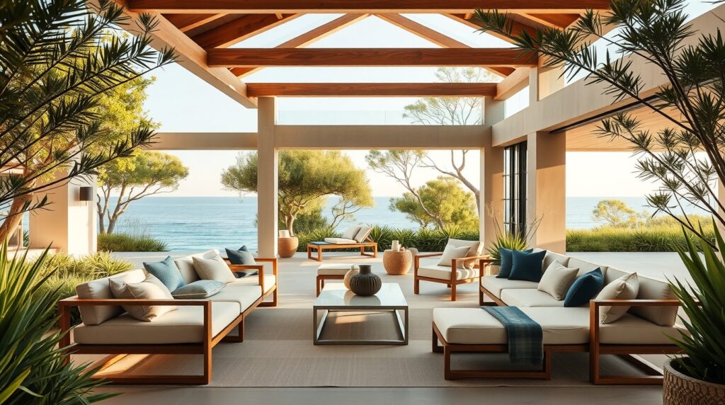
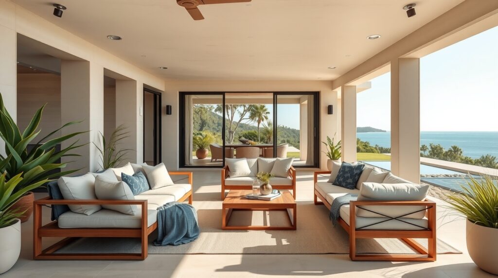
Ocean hues and the romance of depth
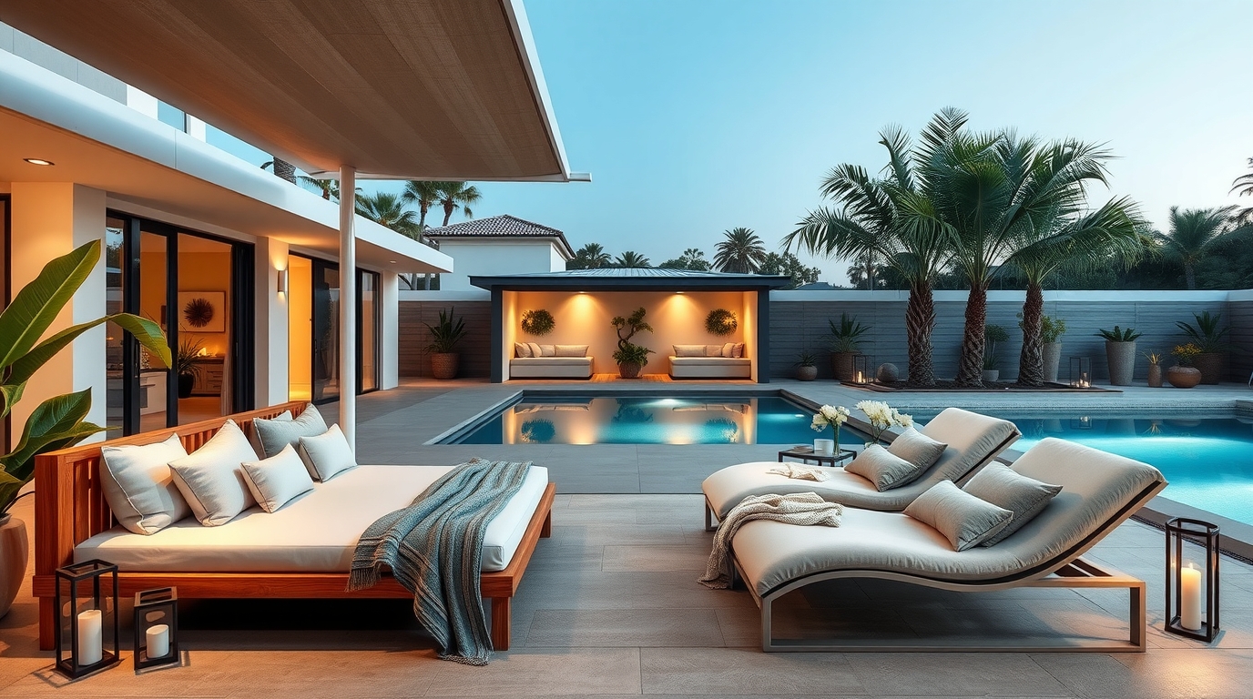
Complementing neutrals are the oceanic tones that bring life and sophistication. From muted sea-foam to deep cobalt, these blues connect the outdoor room to the horizon. They read cool under harsh sun yet glow warmly under evening lights. When combined with sandstone or ivory bases, they create a palette that feels distinctly Australian—luxurious yet relaxed, cosmopolitan yet coastal. Cushions in marine blue or aquamarine piping add subtle rhythm without overwhelming the calm.
Greens, clays, and botanical nuance
Green has re-emerged as a major design language. Not the bright lime of earlier decades, but complex botanical shades—olive, sage, and eucalyptus—often paired with terracotta, rust, or clay. These colours evoke the bush, grounding outdoor furniture in authenticity. A teak dining table surrounded by sage chairs feels contemporary yet timeless. Adding a touch of terracotta through accessories introduces warmth and echoes the Australian landscape’s natural minerals. Together, they form a sophisticated counterpoint to urban hardscapes.
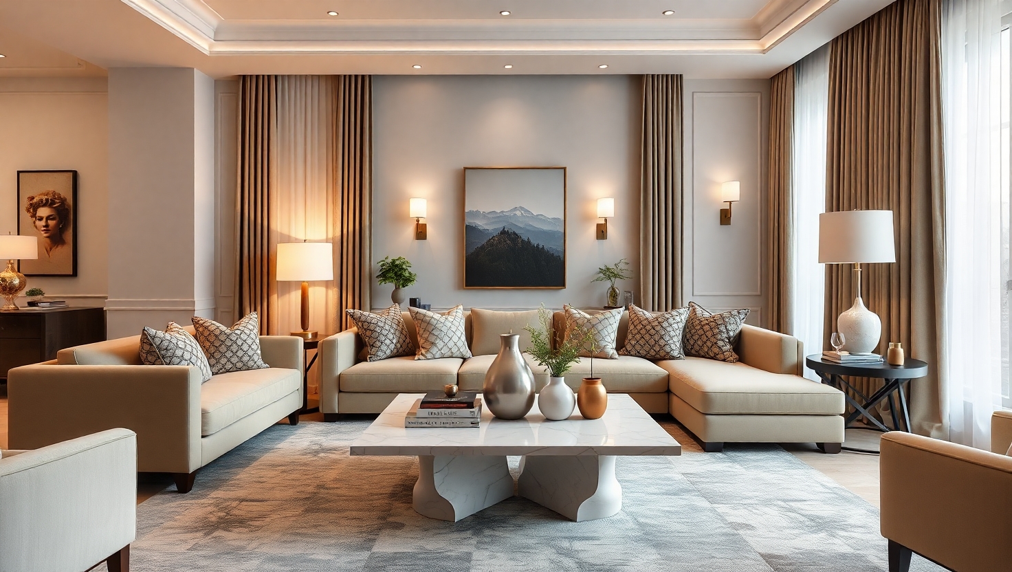
Neutrals as architecture, colour as accent
Luxury outdoor design now treats colour hierarchy like fashion layering. Neutrals provide structure, much like tailoring; accents bring personality, like a scarf or pocket square. The most refined outdoor settings maintain a 70/20/10 balance—about seventy per cent neutrals, twenty per cent mid-tones, ten per cent highlight hues. This proportion ensures visual harmony while allowing individuality. Cushions, ceramics, umbrellas, or feature chairs deliver the bursts of expression that make a space memorable.
Texture gives colour its voice
Colour alone can feel flat in sunlight. Texture gives it dimension. High-end outdoor fabrics today feature weaves that mimic linen, tweed, or bouclé, allowing neutrals to carry interest through shadow and grain. Matte powder-coated aluminium, brushed teak, and slubbed upholstery catch the light differently throughout the day. The combination creates movement and depth without pattern overload. When texture and tone work together, even a single colour family feels multi-layered and rich.
Why Australian light changes everything
Designers trained overseas are often surprised by Australia’s fierce UV and blue-white glare. Colours that look gentle in Europe can appear electric here. The key to success is muting saturation—choosing mid-tones and dusty versions of favourite hues. A sea-foam cushion becomes sophisticated when greyed slightly; terracotta feels modern when toned with clay. The smartest luxury suppliers test their fabrics under local conditions, ensuring colours hold true over years of exposure.
The evolution of black, white and monochrome
Once the hallmark of urban chic, stark black and white is softening. In its place, the modern monochrome palette uses bone, graphite, and ink. These tones are less severe, more tactile, and far easier to maintain. Bone complements sandstone beautifully; graphite pairs with ocean hues; ink grounds paler settings with a sense of permanence. Used correctly, monochrome introduces structure and shadow play rather than contrast for contrast’s sake.
Colour zoning for outdoor spaces
Large outdoor areas often contain multiple functions—dining, lounging, poolside relaxation. Colour zoning provides identity while maintaining cohesion. A dining terrace might feature sandstone upholstery with ocean-blue napery; the adjacent lounge continues the palette in softer greys with indigo scatters. Pool furniture then repeats one or two key hues in lighter tones. When done with restraint, the result feels designed rather than decorated. Cohesion of palette visually enlarges the property and underscores sophistication.
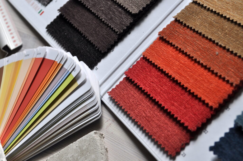
Why limited choice betrays true luxury
Luxury has never been about limitation. A supplier who offers only a handful of fabrics and colours isn’t simplifying your decision; they’re erasing your individuality. True bespoke service allows the homeowner or designer to match tones precisely to architecture, paving, and planting. The Exclusive Home standard—hundreds of fabric options and multiple frame colours at the same price—reflects the reality that taste cannot be mass-produced. Without that breadth, you’re left choosing between “almost right” and “close enough,” which has no place in the language of luxury.
The art of coordinated freedom
Choice, however, must be guided. The goal is not chaos but harmony. The most effective way to use an expansive colour library is to anchor around a dominant neutral, then explore accent variations within two tonal families—say, warm (sand, taupe, rust) or cool (stone, sea, charcoal). By restricting undertones while expanding shades, you achieve coherence with creativity. Couture furniture makers treat this process like tailoring: measured, fitted, refined.
Performance fabrics and colour longevity
The best colour palette means nothing if it fades. Solution-dyed acrylics and Olefin fabrics embed pigment throughout the fibre, resisting UV degradation for up to ten years. These textiles shrug off rain, sunscreen, and mildew while retaining softness. Lesser fabrics are merely surface-dyed, meaning colour sits on top of the thread and vanishes within seasons. Choosing performance fabrics ensures that sandstone remains sandstone and ocean blue remains ocean blue for years to come. It’s not indulgence—it’s investment protection.
Powder-coated finishes and frame tones
Frame colour plays an equally crucial role. Premium aluminium frames come in matte, satin or textured finishes across an extended palette: white, bone, champagne, gunmetal, bronze, and black. Matching frame tones to fabric hues creates visual cohesion that signals quality craftsmanship. The narrow catalogue offered by budget retailers forces compromises; genuine luxury brands maintain multiple shades of each neutral so designers can perfect balance. Frame colour should never be dictated—it should be chosen.
The sensory psychology of colour
Colour shapes feeling. Warm neutrals evoke calm and hospitality; blues suggest relaxation and trust; greens connect us to nature; charcoals and inks introduce sophistication and depth. A successful palette orchestrates these emotions according to how the space will be used. A dining area benefits from warmth that flatters food and skin tones; a pool deck thrives on cool hues that offset heat; a lounge terrace calls for balanced neutrals to host conversation. Understanding this psychology allows colour to serve experience, not ego.
Regional palettes across Australia
Climate and geography influence what feels “right.”
- Coastal Queensland: light neutrals with sea-glass blues and soft coral accents that shimmer under tropical sun.
- Sydney and the Central Coast: sandstone foundations with indigo, eucalyptus and pewter details for an urban-coastal sophistication.
- Melbourne: deeper tones—charcoal, rust and olive—balanced with lighter greys to counter subdued daylight.
- Perth: warm whites, clay and sky-blue combinations reflecting bright light and open skies.
- Adelaide and Canberra: earthy mid-tones and layered neutrals that harmonise with seasonal colour shifts.
Design refinement means responding to place; a uniform palette nationwide feels soulless.
Lighting and the night palette
Daylight reveals hue; night lighting reveals tone. Under warm LEDs, sandstone and clay glow golden; cool lights can make them appear chalky. Luxury design tests fabrics under both conditions. By evening, darker hues like indigo or charcoal provide drama while lighter cushions gleam invitingly. A curated night palette transforms outdoor spaces into evening sanctuaries, ensuring luxury endures after sunset.
The influence of texture on maintenance and ageing
Some colours are inherently forgiving. Heathered fabrics, slubbed weaves and mid-tone neutrals hide everyday dust better than flat whites. Finishes with micro-texture reduce visible fingerprints and watermarks. When a supplier offers hundreds of variations, you can select not only the colour that pleases the eye but also the one that suits your environment and lifestyle. Choice equals control over ageing—another key marker of true luxury.
Sustainability and eco-responsible pigments
Colour innovation increasingly intersects with environmental ethics. Many mills now use low-water, low-chemical dye processes and recycle offcuts into new yarn. Natural mineral pigments and solution-dyed synthetics last longer, reducing waste. Sustainability is therefore not at odds with style; it enhances it. Clients who insist on eco-conscious colour ranges demonstrate discernment as well as taste.
Coordinating accessories and accent materials
Umbrellas, rugs, planters, and lanterns complete the palette. The key is tone alignment rather than direct matching. A sandstone sofa pairs gracefully with a slightly darker rug; ocean-blue cushions find echo in glazed ceramic planters. Metallic finishes—brushed nickel, soft gold, bronze—act as neutrals in their own right, adding sophistication without breaking unity. A cohesive colour story across accessories ensures the entire outdoor zone reads as one luxurious environment.
How to design a lasting palette
Begin with the architecture. Observe the colour temperature of cladding, paving and landscape. Choose a base neutral that complements these fixed tones. Layer two secondary hues—one cool, one warm—for flexibility across zones. Add a highlight that can be changed seasonally without disturbing the foundation. Request large fabric swatches from your supplier and test them outdoors at different times of day. Only a supplier with extensive range can support this level of testing. The right colour should look beautiful in morning sun, afternoon glare and evening shadow alike.
The emotional advantage of abundance
When clients see hundreds of options arrayed before them, they feel empowered rather than overwhelmed—provided the range is curated. Abundance allows discovery; it invites dialogue between designer and homeowner. Every home has its own light quality, garden character and architectural rhythm. Finding the perfect hue becomes a creative journey rather than a compromise. This is the emotional reward of true bespoke luxury.
Why breadth of choice protects investment
Colour continuity matters for long-term value. Being able to reorder identical fabrics or frame finishes years later ensures the property remains cohesive as it evolves. Limited-range suppliers cannot guarantee repeat availability, forcing mismatched replacements. A serious luxury house maintains colour codes and dye lots for every option, protecting your investment and maintaining harmony over time.
When fashion meets permanence
Trends will come and go—sunset terracottas one year, sage greens the next—but timeless design relies on moderation. Choose contemporary accents within a foundation of neutrals that age gracefully. The principle mirrors haute couture: seasonal variation atop a classic silhouette. True luxury isn’t the newest colour; it’s the confidence that your palette will still feel sophisticated a decade from now.
Case studies in palette success
A coastal penthouse might feature bone frames, sandstone cushions, and deep-navy scatters echoing the sea beyond. A Melbourne terrace could reverse the formula—graphite frames with olive cushions and clay highlights for warmth. A hinterland retreat might pair teak with eucalypt and rust, reflecting bushland hues. Each project begins with personality, not product. Such precision is only possible with extensive options at hand.
Maintenance, realism and long-term grace
Luxury colour is not about perfection on day one; it’s about graceful ageing. Teak will silver, fabrics will soften, metals will develop patina—all intended outcomes when quality materials are chosen. Selecting colours that age beautifully underpins satisfaction years later. Again, the ability to test variations and predict how tones mellow over time depends on supplier range and expertise.
The supplier’s responsibility
A genuine luxury supplier is a curator, not a gatekeeper. Their role is to guide clients through possibilities, providing expert advice on undertones, light reflection, and coordination—not to limit choices for convenience. Limiting options may simplify inventory, but it diminishes design integrity. You deserve access to the full orchestra, not a few instruments.
Conclusion: Colour as the signature of individuality
Colour defines the soul of your outdoor living environment. It determines whether your terrace feels tranquil, dynamic, or indulgent. The current movement—from sandstone neutrals to ocean hues and beyond—celebrates authenticity, balance, and personal expression. Yet the essence of luxury lies not in a specific palette but in the power to choose one that reflects you perfectly.
If your supplier offers only a narrow spectrum, they are denying you that creative freedom. Demand abundance, demand quality, and design with intention. With over three hundred fabric colours and eight frame finishes available as standard, The Exclusive Home empowers Australians to craft outdoor spaces that are uniquely theirs—luxurious, durable, and infinitely personal.