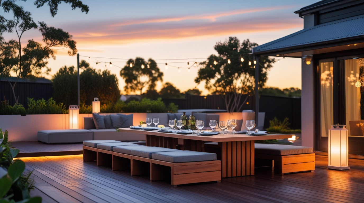
Outdoor living has evolved into one of the most expressive design platforms in modern Australian homes. Where once the backyard was a functional space—some paving, a barbecue, a few timber chairs—today’s outdoor environments are curated with the same level of intention as interior living rooms. What separates premium homes from the ordinary is the thoughtful, strategic use of bespoke outdoor colour palettes. These palettes don’t merely decorate a space; they define the home’s presence, personality, and sense of identity.
As outdoor furniture becomes increasingly customisable—with hundreds of fabric choices, powder-coated aluminium frame colours, designer textures, and contemporary finishes—the opportunity for homeowners to create a truly unique alfresco character has never been greater. Done well, personalised outdoor colour palettes can elevate a property’s profile, influence mood, and reinforce architectural style. This is where styling meets artistry, and where premium homes distinguish themselves from their mainstream counterparts.
This article explores how colour impacts perception, how outdoor palettes can be harmonised with interior schemes, and how homeowners can use custom fabrics, frame colours, and finishes to create distinctive outdoor areas that reflect both lifestyle and personal taste.
The Power of Colour in Outdoor Design
Colour is more than a visual choice—it’s an emotional language that communicates identity, atmosphere, and aspiration. Outdoors, colour becomes even more influential because it interacts with natural light, greenery, shadows, reflections, and the sky. This interplay produces dynamic visual effects that interior colour schemes can’t achieve.
Colour Shapes Emotional Experience
Colour influences mood before the homeowner even sits down:
- Whites, Creams, and Beiges: Create a fresh, resort-like atmosphere.
- Charcoal, Black, and Deep Neutrals: Offer sophistication and architectural boldness.
- Turquoise, Seafoam, and Muted Blues: Evoke coastal calm.
- Terracotta, Clay, and Eucalyptus Green: Feel warm, earthy, and distinctly Australian.
- Bold Accents: Such as mustard, coral, or red introduce personality and vibrancy.
Colour is the element that instantly signals whether a home is modern, coastal, classic, earthy, bohemian, or minimalist.
Colour Reflects Lifestyle
The outdoor palette should match the way the space is used.
- A family-friendly alfresco zone benefits from warm, uplifting tones.
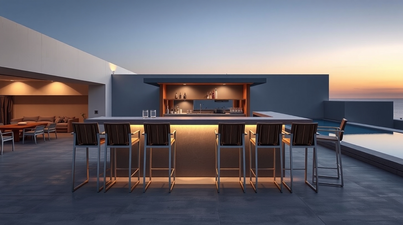
- A luxury poolside retreat leans toward crisp whites, ocean blues, and champagne neutrals.
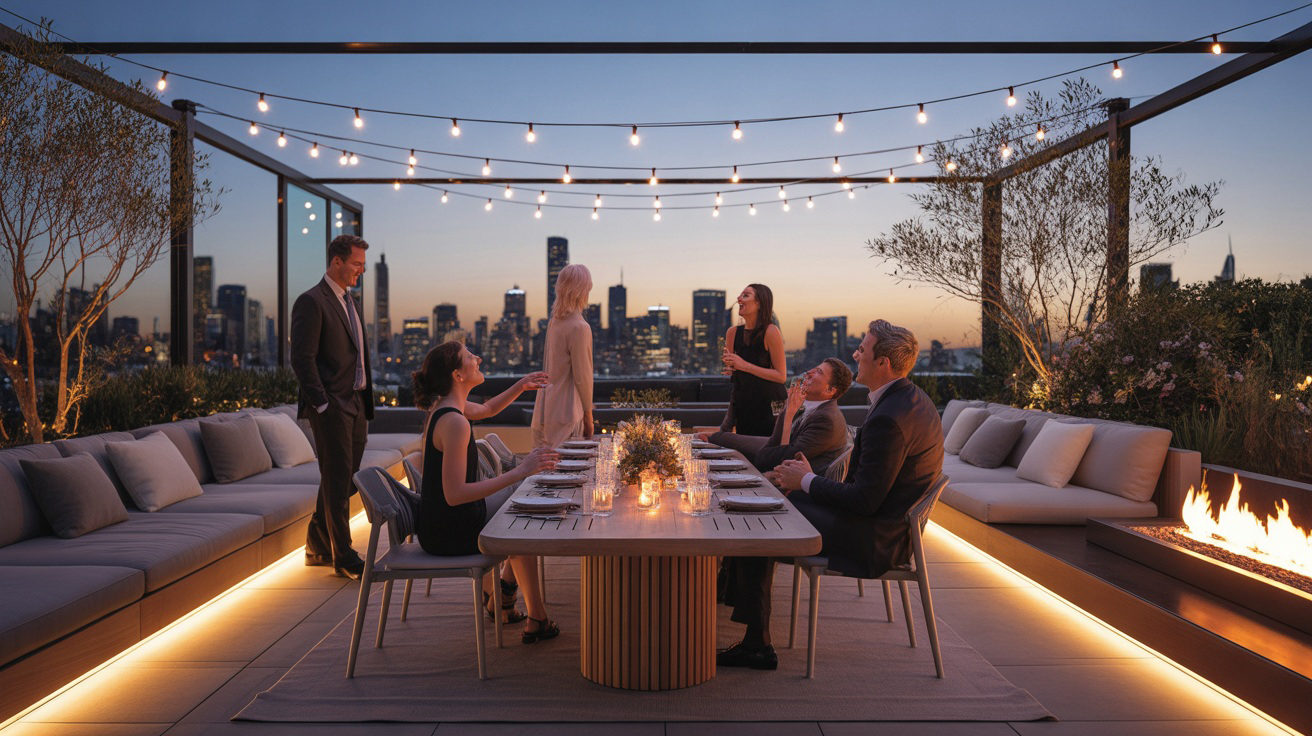
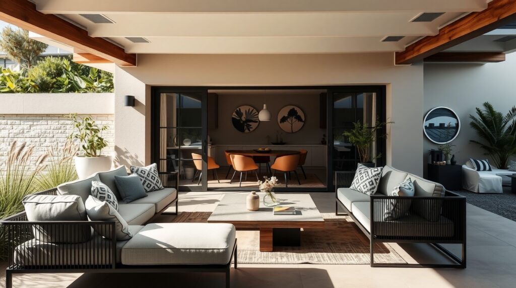
- A sophisticated entertainer’s courtyard often embraces dark monochromes or a European-inspired stone palette.
- A nature-focused home might choose eucalyptus, muted greens, and earthy timber tones.
Colour is a direct reflection of how a homeowner lives and what they value.
The Five Foundations of a Bespoke Outdoor Colour Palette
Designers use five primary elements to build palettes that feel intentional, cohesive, and harmonious.
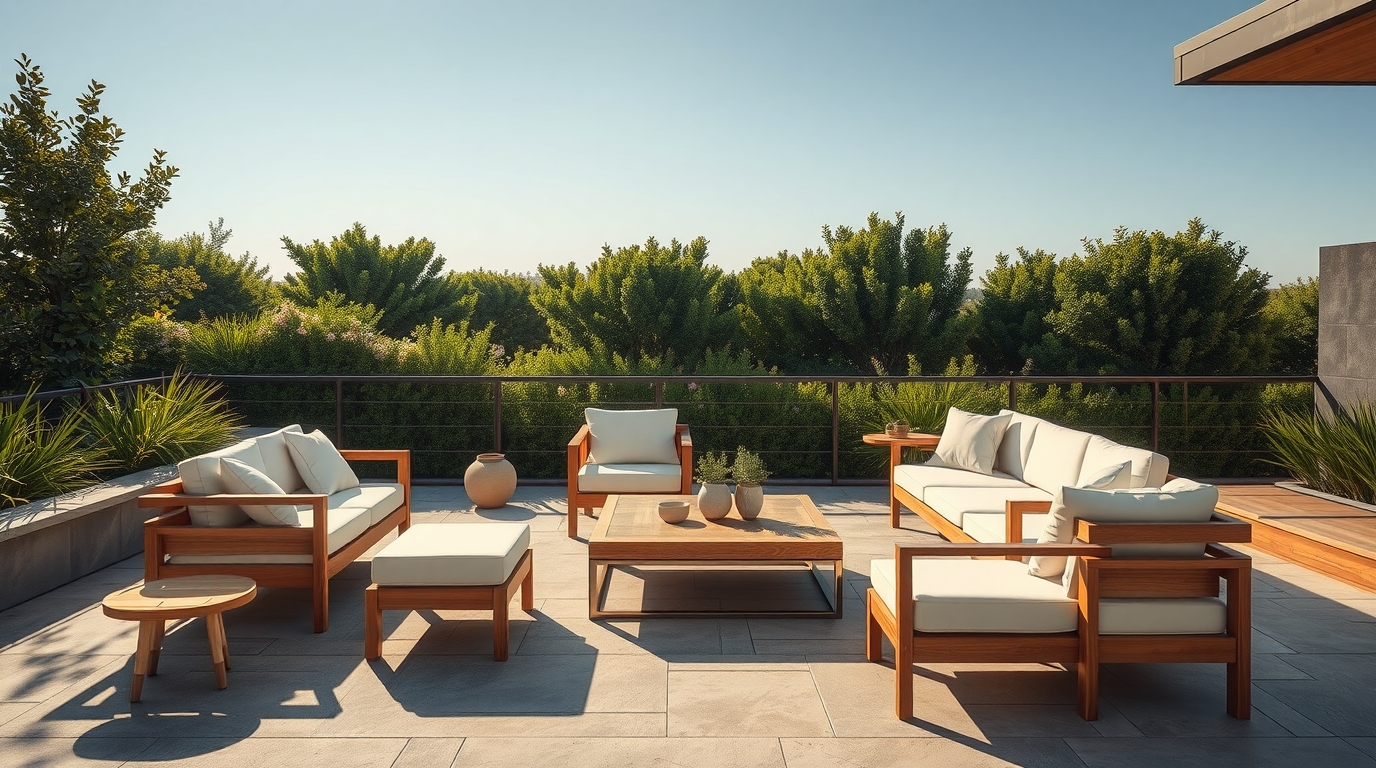
1. Base Colour Family
This is the dominant colour that defines the tone of the outdoor environment. Base colours are usually neutrals, including warm white, soft taupe, stone grey, beige, or charcoal. The base colour should align with the home’s architectural palette—roof colour, external paint, window frames, and flooring.
2. Secondary Supporting Colours
These colours bring depth and visual layering. They may be slightly darker or lighter versions of the base colour or complementary hues. For example, a charcoal base pairs beautifully with slate or smoke grey, while a sand-toned base blends well with oatmeal, ivory, or light mocha.
3. Accent Colours
Accent colours personalise the space and give the outdoor zone its character. They may appear in cushions, occasional chairs, outdoor rugs, table décor, side tables, or plant pots. Examples include Turquoise + White for coastal luxury or Olive + Rust for organic sophistication.
4. Natural Elements
Greenery, stone, timber, and landscaping materials heavily influence the palette. A home surrounded by lush foliage may lean toward cool neutrals, while a stone-heavy aesthetic may pair best with warm earthy tones.
5. Contrast and Balance
Contrast determines whether the space feels bold and dynamic or soft and calming. High contrast (charcoal frames + white cushions) delivers modern energy, while low contrast (beige frames + matching sand cushions) feels serene and gentle.
How Personalisation Transforms Outdoor Colour Design
In the past, outdoor furniture came in a handful of colours. Today, luxury buyers expect far more. Modern manufacturers now offer 300+ outdoor fabric colours, multiple textured weaves, and 8+ aluminium frame colours. This opens the door to genuine bespoke styling.
Fabric Personalisation
Luxury outdoor fabrics now feature rich textures, linen-style weaves, and soft-touch materials. These fabrics allow outdoor cushions to mimic interior aesthetics, creating cohesive transitions between spaces.
Frame Colour Customisation
Aluminium frames can now be powder-coated in shades like textured black, storm grey, champagne, taupe, eucalyptus, or coastal blue. Frame colour strongly influences whether a set feels architectural, coastal, or earthy.
How to Build a Bespoke Outdoor Colour Palette: A Step-by-Step Guide
This is the process interior designers use for high-end customers:
- Assess the Home’s External Architecture: Look at the façade, roof, window frames, and flooring. These elements anchor the palette.
- Determine the Mood: Do you want bold and striking, serene and calming, or minimalist and modern?
- Select the Base Colour: This should align with the home’s main architectural colours.
- Choose Two Secondary Colours: These create depth and layering.
- Add One or Two Accent Colours: These express personality and should appear sparingly.
- Apply Personalisation Through Fabrics & Finishes: Use custom options to match indoor living palettes or enhance landscaping.
Colour Palette Inspiration for Australian Homes
- Modern Coastal: White frame with turquoise, seafoam, ocean blue, and sand accents.
- Urban Contemporary: Charcoal frame with slate grey, black, and stone tones.
- Earthy Mediterranean: Taupe frame with terracotta, caramel, and olive green.
- Minimalist Australian: Off-white frame with eucalyptus, warm grey, and oat cushions.
- Resort Luxe: Champagne frame with oyster, cream, and gold premium woven fabrics.
Why Outdoor Colour Personalisation Defines a Home’s Character
A home’s outdoor palette is one of the first things guests notice. It shapes emotional connection, enhances architecture, strengthens continuity, and communicates personality. Bespoke colours make the home instantly recognisable, memorable, and unmistakably refined.
To explore over 300 outdoor colours, custom fabrics, and premium finishes, visit: www.theexclusivehome.com.au